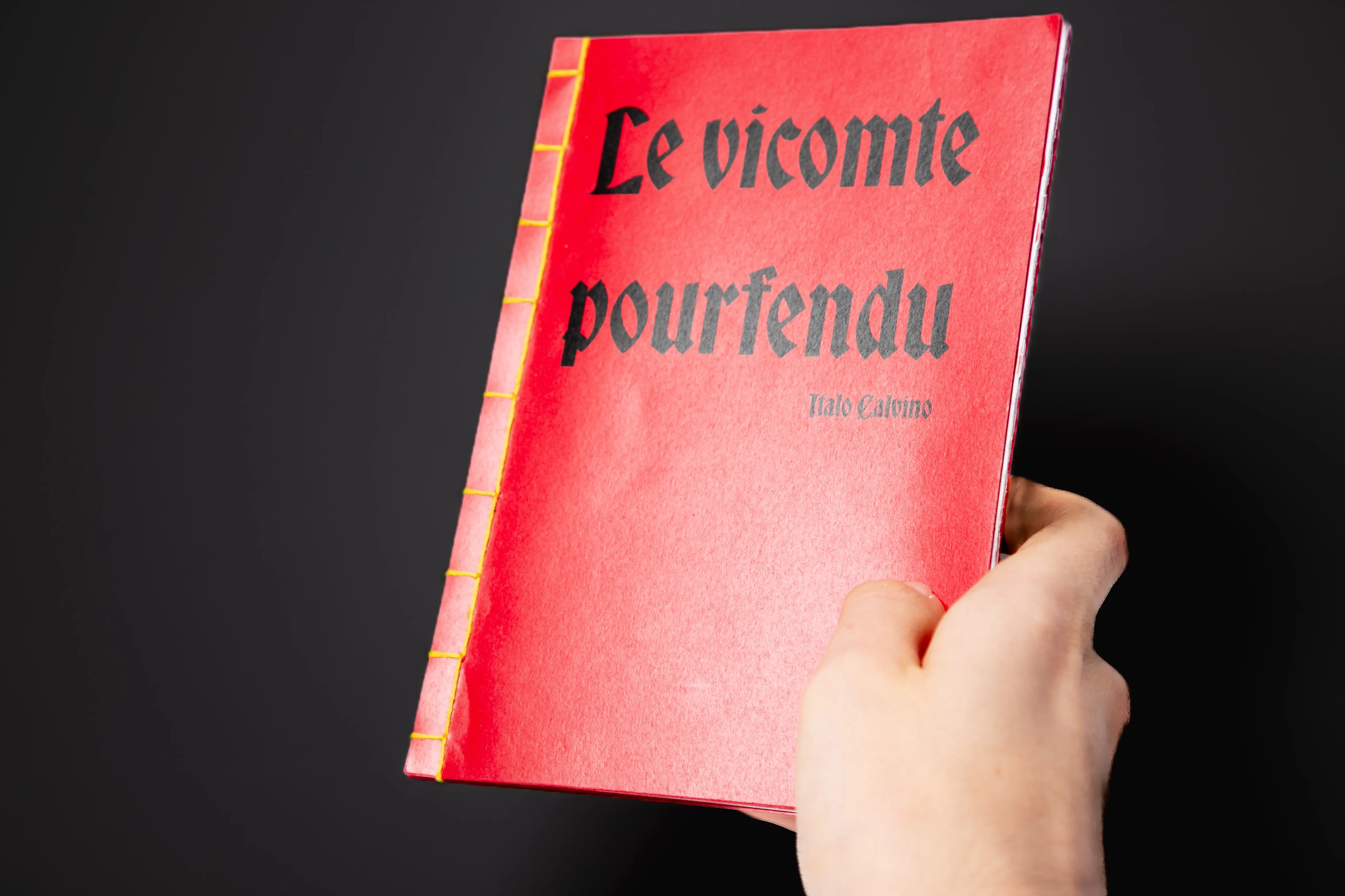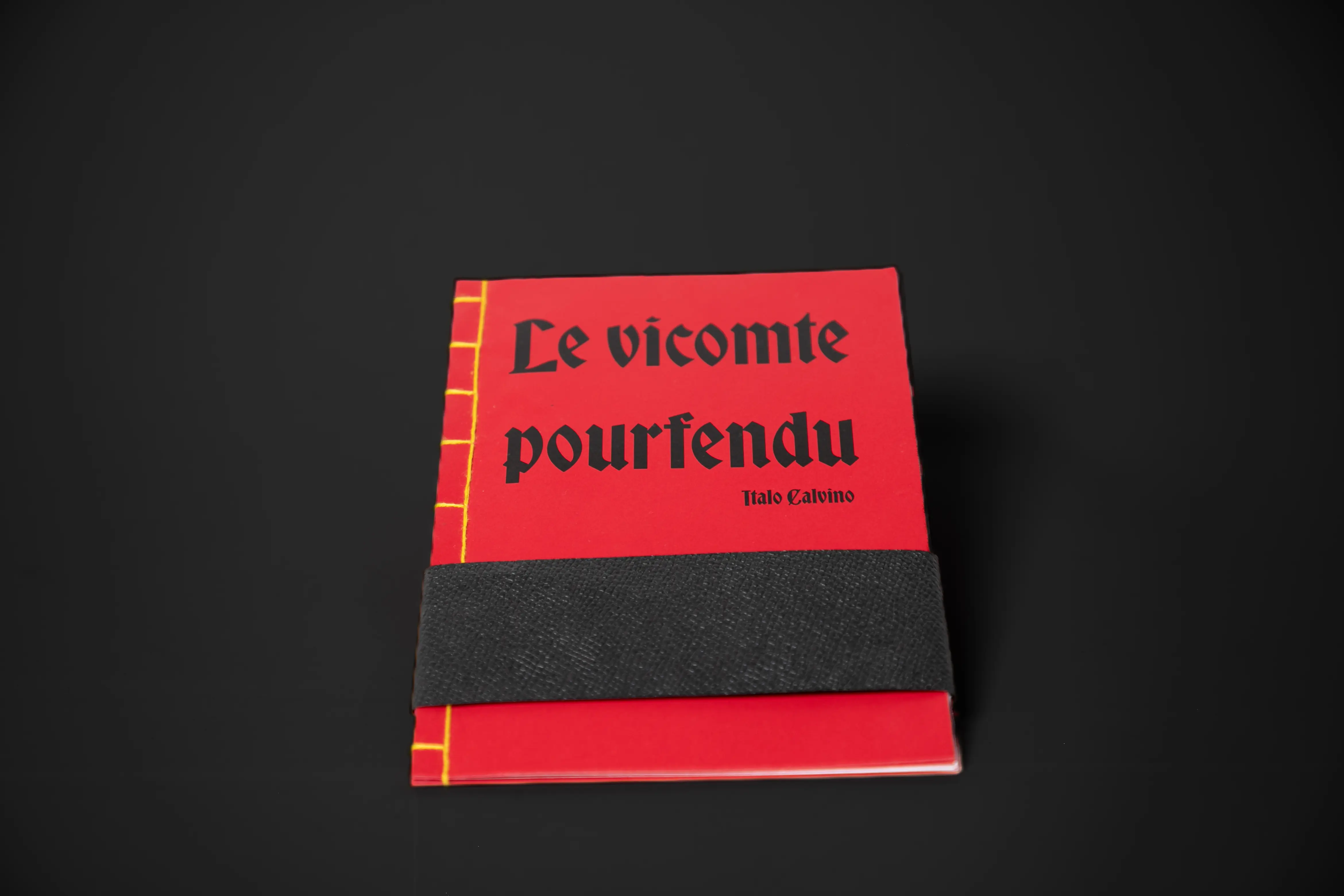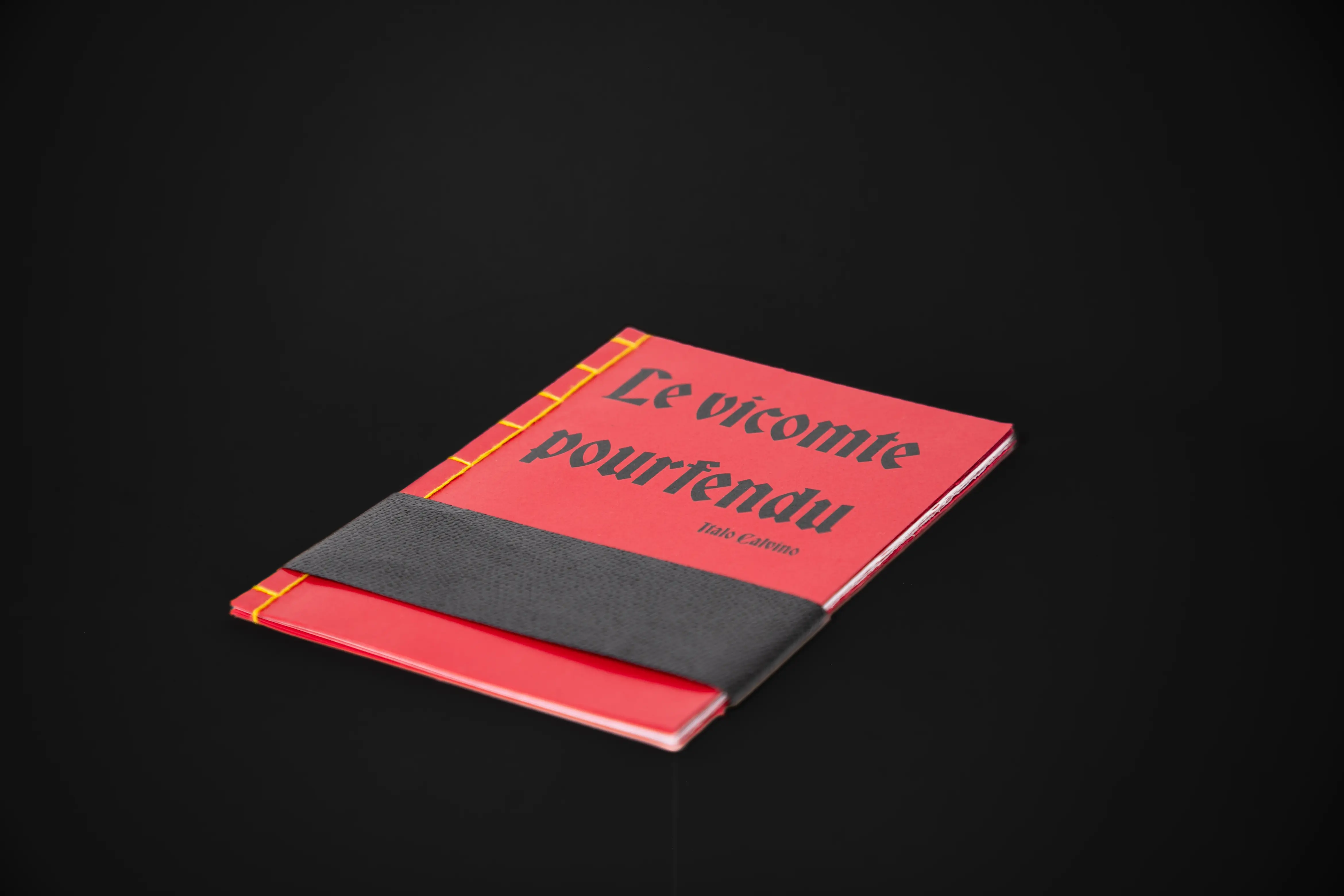
For this project, we were asked to read Italo Calvino's Le vicomte pourfendu and illustrate it by selecting key passages and developing a personal concept based on graphic simplicity and humor.
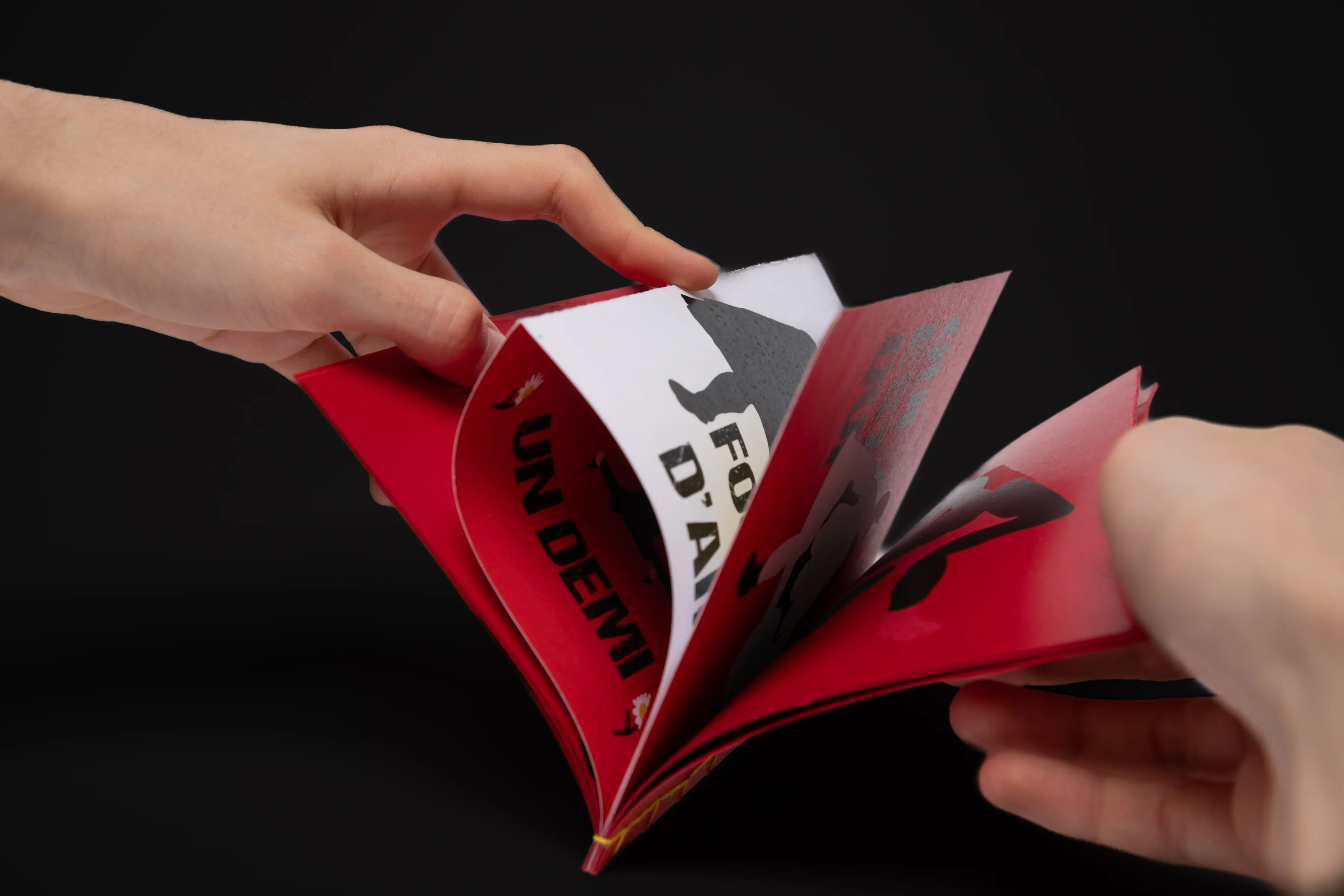
I chose to adopt a deliberately simple style, with a tichromatic scheme of red, yellow and black symbolizing good and evil, and clear compositions. This choice was intended to emphasize the absurd and ironic side of the story, while making the scenes more accessible and visually striking.
To reinforce the comic aspect, I accompanied each illustration with a humorous title, which plays on the content of the passage or the behavior of the characters. These titles function as ironic mini-comments, adding a second level of reading and creating a discrepancy between the image and my interpretation.
Through this project, I explored how illustration can transform the reading of a text by providing a different visual and narrative point of view.