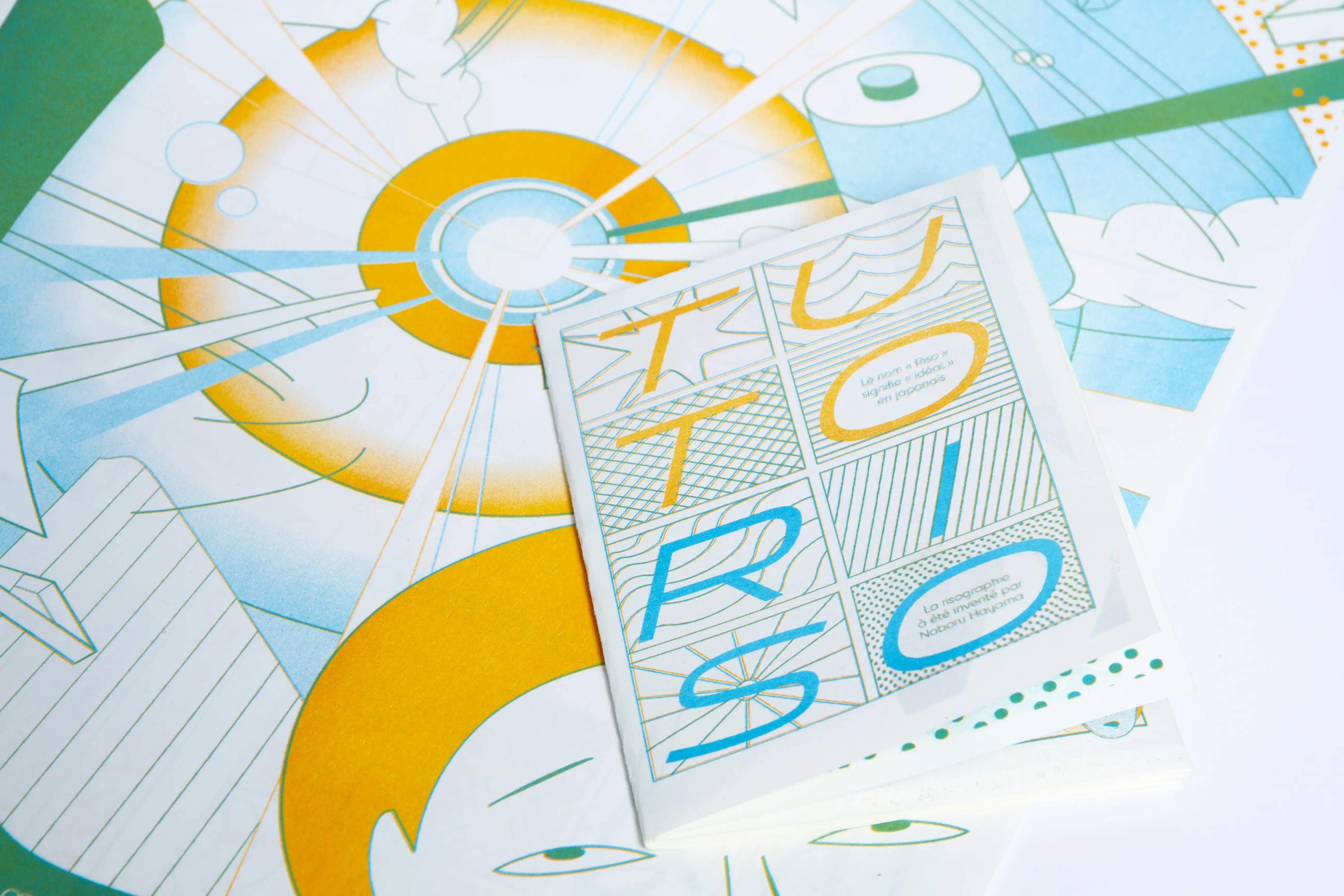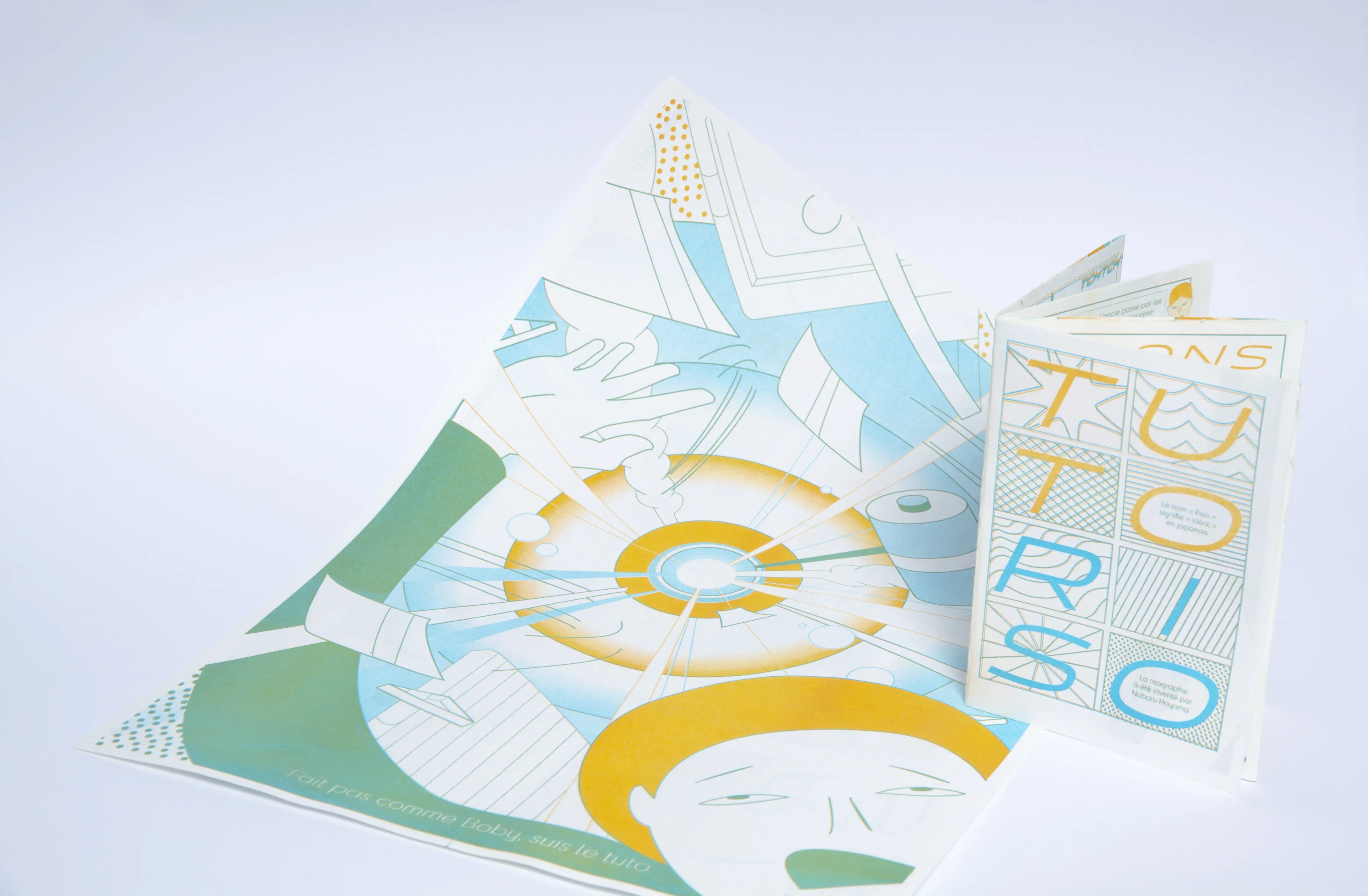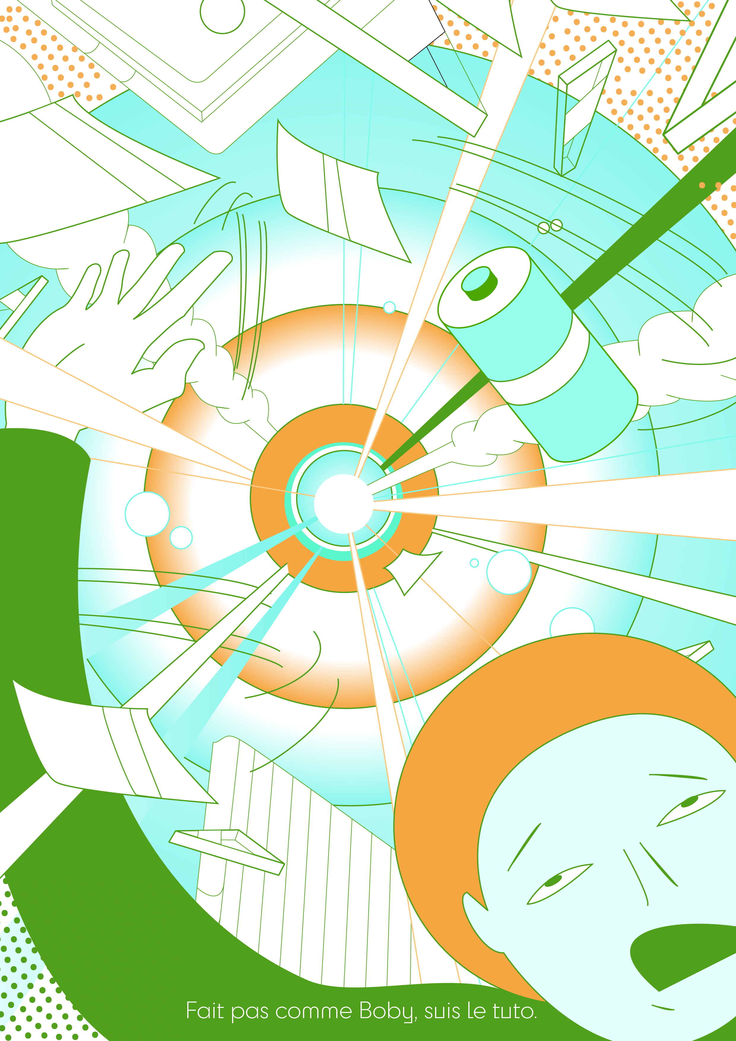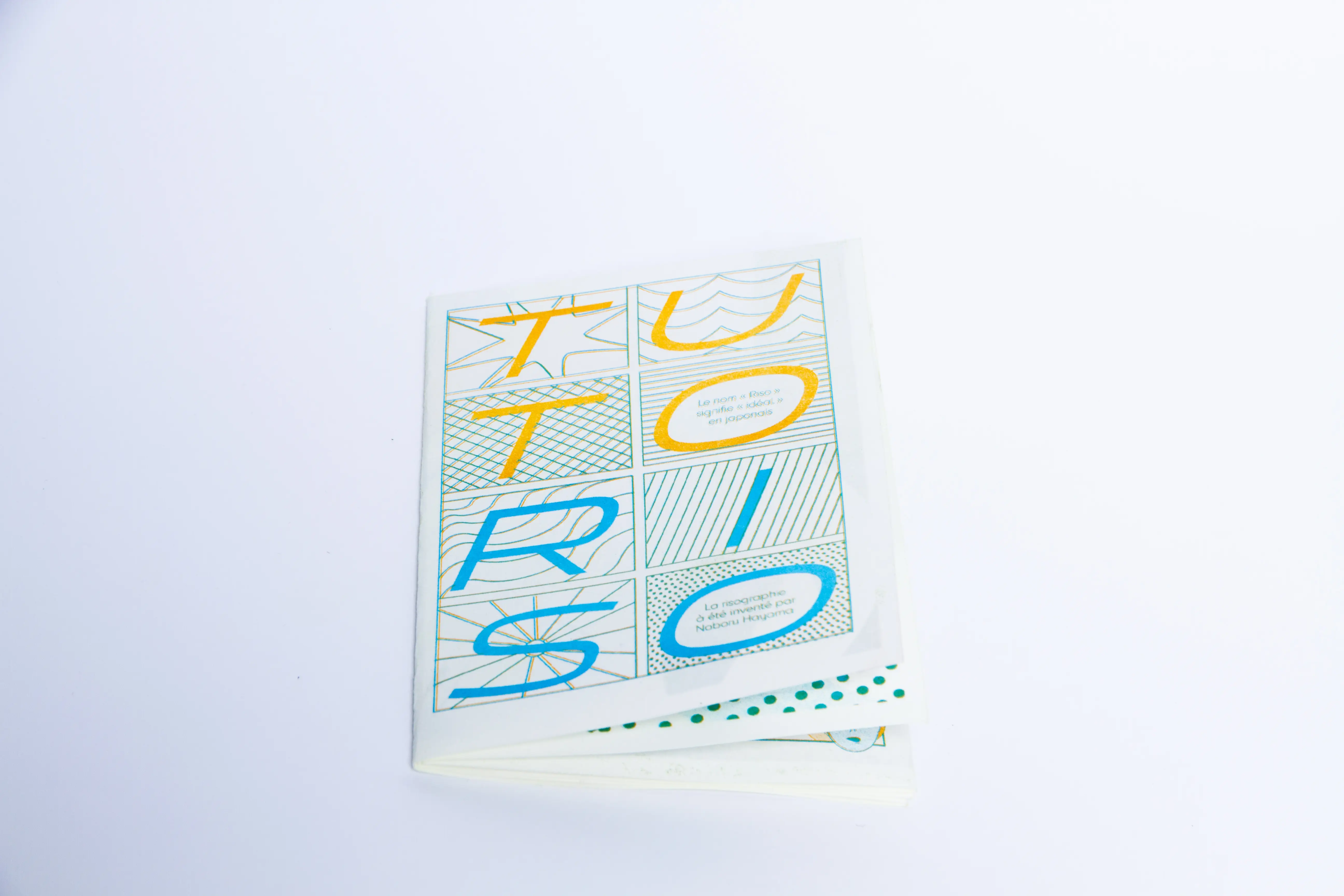
In this project, we had to create a risography-printed fanzine with the aim of providing a simple, visual explanation of how risography works.
The main constraint was to be inspired by the graphic universe of a manga author (assigned to each of us), Yuichi Yokoyama, and to work with only two colors per group.
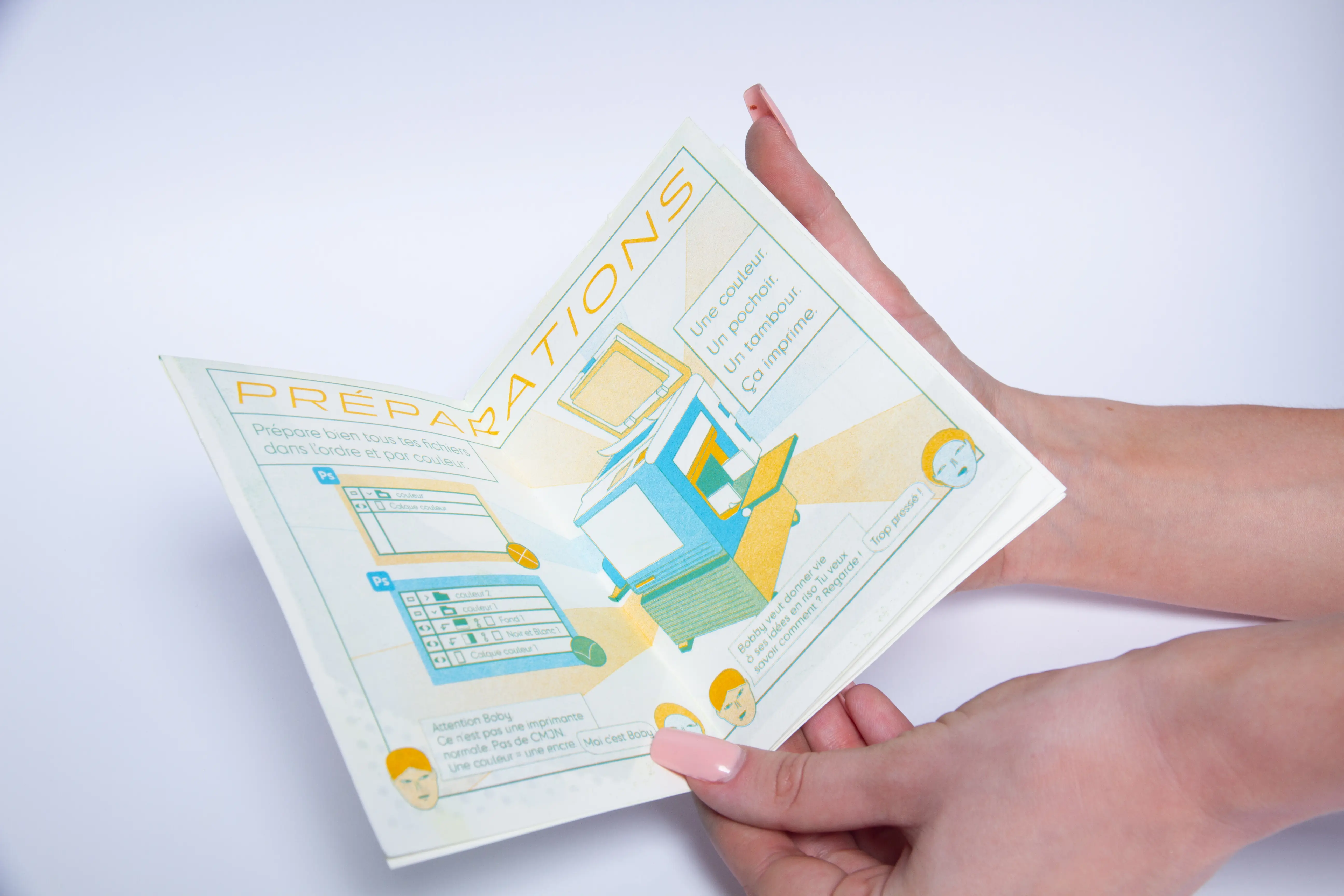
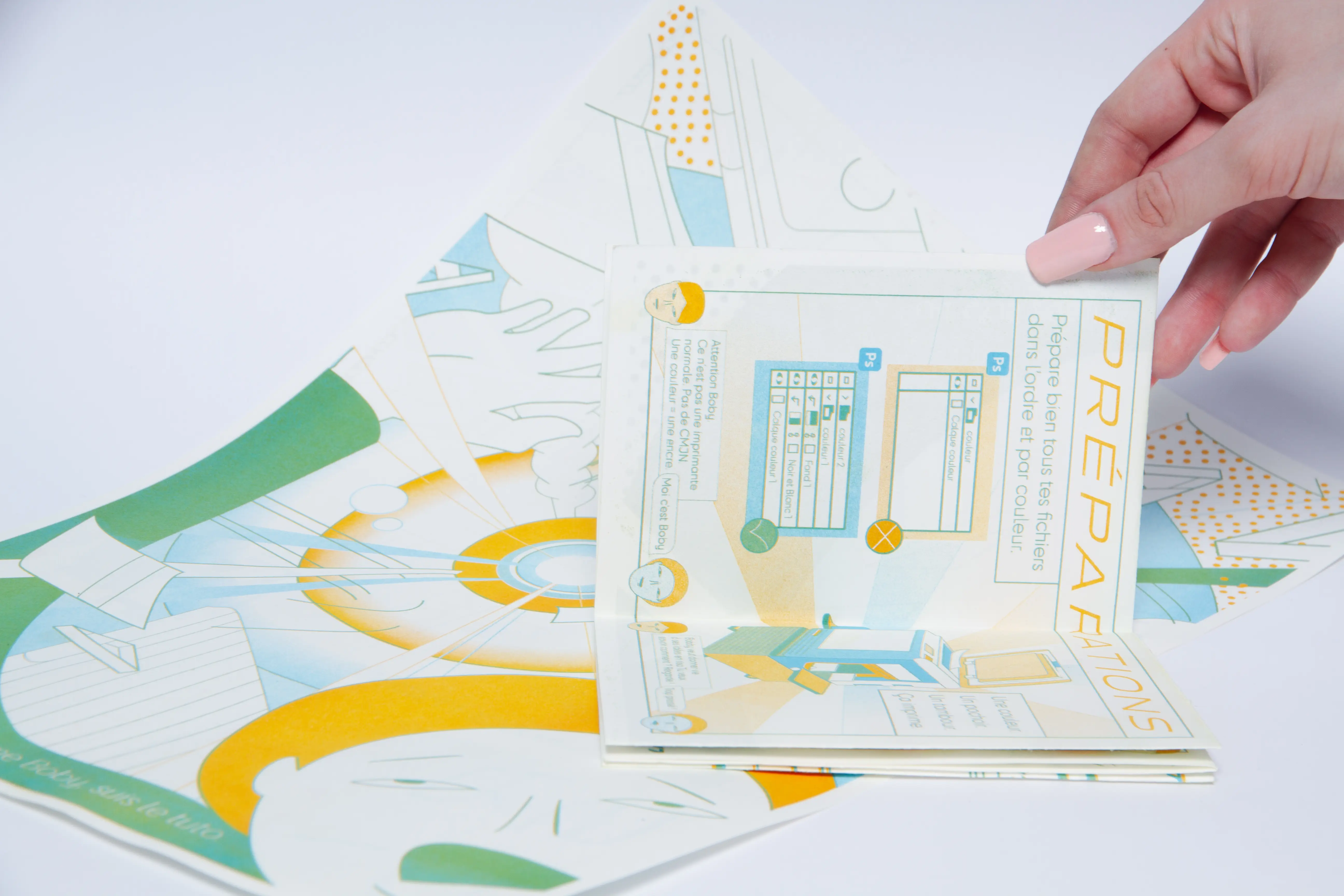
We chose to design the fanzine as a playful manual, with clear illustrations, diagrams and a dynamic layout. The graphic style takes up the visual codes of the chosen manga author, while adapting the technical elements of risography (superimpositions, screens, offsets, etc.).
This project enabled me to understand how to make a complex technique more accessible, while exploring the limits and advantages of risographic printing in a creative context.